
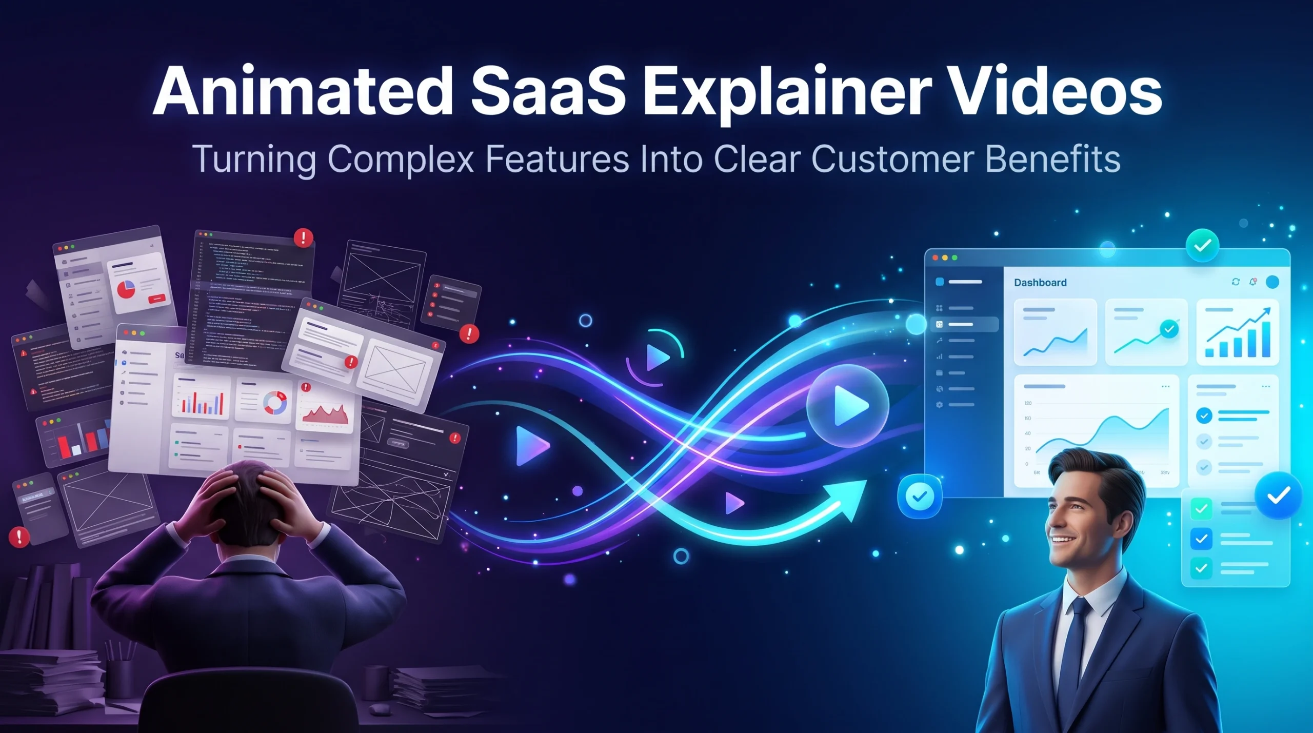
A field guide for product marketers who are tired of explaining the same feature twice.
Ask a product team what role-based permissions do, and you’ll get a precise answer. Ask a buyer, and you’ll get a shrug, until someone mentions the new hire who started work on day one without filing an IT ticket. That gap between what gets shipped and what gets bought is where most SaaS marketing quietly fails. Animated SaaS explainer videos are one of the few formats built to cross it, because they can show the feature and the life it changes in the same frame. Below: how to do it well, including the benefits that are hardest to show.
Climb the Ladder Before Anyone Opens a Storyboard
Every feature can be translated in four steps. A feature is what the product has. Function is what it does when someone uses it. Outcome is what changes in the user’s work. Proof is how the buyer will know it happened. Writing this out for each capability, before any creative work starts, is the single most useful hour a SaaS team can spend on a video.
| Feature | Function | Outcome | Proof |
| Role-based permissions | Each user sees only the data their role needs | New hires get access on day one, no IT ticket | Onboarding time per user drops; audits close faster |
| Automated reconciliation | Bank feeds match ledger entries without manual review | Month-end close finishes days earlier | Close moves from day eight to day three |
| AI meeting summaries | Calls get transcribed and summarized with action items | Reps update the CRM in seconds instead of minutes | CRM completeness rises; admin time falls |
| Native integrations | Data syncs with tools the team already uses | No more copy-paste between systems | Fewer duplicate records and sync errors |
The ladder also tells you what to cut. Outcome and proof carry the persuasion, so they get most of the screen time. The feature name is the weakest rung. It can appear as a small label while the outcome plays out, and nobody will miss it.
Introduce Your Script
To The World With Our
Explainer Videos

What Animation Shows That Your Product Can’t?
A screen recording captures the feature and the function. It can’t capture the outcome, because outcomes happen outside the software, in a finance team’s Friday evening or a clinic’s overflowing waiting room. Animation can move between both worlds.
That’s the real reason contrast works so well in SaaS video. You can show the current mess, with spreadsheets, sticky notes, and seven open tabs, and then replay the same moment with your product in place, using matched framing so the difference is impossible to miss. Time-based benefits get the same treatment. “Saves six hours a week” is an abstract claim; a calendar visibly clearing itself is something a viewer feels.
Animation also edits reality in a way recordings can’t. A real dashboard has forty elements on it, and three of them matter to the story. Animation can show only those three, then reveal the full interface once the viewer knows where to look.
And it gives benefits a face. A character who goes from frazzled to calm carries more emotion than any cursor. Custom 2D animation is especially good here, because an illustrated character can stand in for an entire buyer persona without casting, filming, or tying the brand to one actor. This piece on how character design shapes a 2D animated video goes deeper into designing characters your buyers will recognize.
The SaaS Benefits That Resist Explanation
Some capabilities are easy to animate. Others fight back, and they’re often the ones animated SaaS explainer videos are hired to handle. These five come up constantly, and each needs its own visual approach.
AI Features
AI is the hardest sell in software right now, because buyers have heard every claim and trust very few of them. Showing a glowing brain or a swirl of particles makes it worse. What works is showing inputs and outputs: here is the messy call transcript, here is the clean summary with three action items, here is the human approving it before it goes to the CRM. Make the review step visible. Buyers want to see that a person stays in control, and that the output is checkable.
Integrations
Integrations are invisible plumbing. A wall of partner logos says the connection exists without saying why anyone should care. A better approach follows one piece of data across systems: a deal closes in the CRM, the invoice appears in accounting, the onboarding task lands in the project tool, all without anyone retyping a thing. The viewer watches the work disappear.
Security and Compliance
SOC 2 reports, SSO, audit logs, and data residency are buying requirements in most mid-market and enterprise deals, and they’re painfully dry on a feature page. Animation can turn them into reassurance. Show an auditor’s request being answered in minutes because the log already exists. Show a departing employee losing access to everything in one action. The control becomes a moment of relief for the buyer.
Analytics and Reporting
Dashboards are easy to show and hard to sell, because a chart says nothing about the decision it enables. Animate the insight instead of the chart. A line dips, a manager spots the dip on Monday instead of at quarter end, and a specific action follows. The data matters because of what someone did with it.
Collaboration and Network Effects
Some products get more valuable as more people use them. That’s difficult to communicate in a single-user screen recording. Animation can show the product spreading: one team adopts it, a second team joins because the first one shares work there, and the friction between departments shrinks. The viewer understands why the product’s value compounds.
How Much of the Real Interface Belongs on Screen?
This is one of the first decisions in any SaaS video, and it affects shelf life as much as clarity.
| UI level | What it looks like | Best for | How fast it dates |
| Literal | Pixel-accurate recreation of real screens | Feature launches, onboarding, technical buyers | Fast: any redesign shows |
| Simplified | Real layout and brand colors, clutter removed | Homepage and product page explainers | Moderate: survives minor UI updates |
| Symbolic | Icons, cards, and shapes that suggest the product | Awareness campaigns, category explainers, ads | Slow: outlasts major redesigns |
Simplified UI suits most homepage explainers. Trial users still recognize the product when they log in, and the video survives a year of design tweaks. If your story leans on interface motion, callouts, and transitions, our motion graphics work shows how we treat UI elements on screen.
Proof From Our Own Work
My Appointments, a US scheduling app for medical and health practitioners, had a familiar problem. Its pitch was a feature list that looked like every competitor’s. Visitors skimmed the text-and-screenshot homepage and left, app store listings underperformed on static screenshots, and the sales team had nothing to send after a first call.
The My Appointments SaaS explainer video leaned entirely on contrast. A chaotic practice day played out with fast, escalating motion and tense sound, then the same day replayed with the app in place, slower and calmer, with recreated product UI doing the work. After it went live on the homepage, the client reported a 77% increase in visitor-to-signup conversion and a 45% improvement in paid social cost per acquisition. Sales adopted it as a first-touch asset too. The product itself was the same. What changed was how clearly it was explained.
Choosing a Look
Visual style is a positioning decision, and buyers read it before the narrator speaks. Flat corporate illustration signals approachable and efficient, which suits SMB, HR, and productivity tools. Semi-flat styles with depth and texture read as premium, a good match for fintech and mid-market platforms. Isometric scenes suggest systems and scale, which is why infrastructure, data, and DevOps companies use them so often. Developer tools and security products tend to do better with minimal, UI-led motion graphics. Healthcare, education, and consumer-facing SaaS usually benefit most from character-led stories.
Whatever you pick, use it everywhere: the master explainer, feature cutdowns, onboarding clips, and paid social. Our breakdown of 12 animated explainer video styles shows each option in action. A consistent look is what turns a handful of animated SaaS explainer videos into a brand asset people recognize in a crowded feed.
Where SaaS Explainers Usually Go Wrong?
The most common failure is the guided tour. A first draft walks through the product navigation, one feature at a time, in menu order. Product teams find it thorough. Everyone else finds it exhausting. Three outcomes are plenty for a marketing video, and the full tour belongs in onboarding.
A close second is the everyone video. Platforms with several personas try to speak to the admin, the end user, the executive, and the developer at once, and each one gets fifteen seconds of attention. Nobody feels understood. Build the main video for the person who signs the contract, then cut separate versions for the others.
The third is internal vocabulary. Teams develop their own language over time: module names, sprint codenames, terms borrowed from analyst reports. Buyers think and search in plain words. A quick test catches most of it. Read each line to someone in sales or support and ask if a prospect would ever say it out loud. If the answer is no, the line needs rewriting.
One Master, Many Placements
A single well-planned explainer can serve the whole funnel. The 60- to 90-second master anchors the homepage. Twenty- to forty-second cutdowns, each focused on one outcome, sit on feature and solution pages. A short clip on the pricing page can explain what changes between tiers and head off a stream of support questions. Reps can send the master after first calls so champions can share it internally, and marketplace listings on the Salesforce AppExchange, Shopify App Store, or Atlassian Marketplace get a short version that helps them stand out among similar apps. For paid social, vertical and square cuts do the work. This guide to B2B LinkedIn animated video ads covers formats and lengths.
Animated SaaS explainer videos planned this way cost far less per asset than one-off videos commissioned feature by feature, because the characters, environments, and UI components carry over to every new piece.
Knowing It Worked
Measure what changes on the page where the video lives, against a baseline taken before launch. For a homepage explainer, the headline number is visitor-to-trial or visitor-to-demo rate, compared over four to six weeks or tested with a proper A/B split. Play rate tells you if the thumbnail and placement are doing their job, and the drop-off curve shows which scene loses people. If reps send the video after calls, compare how fast those deals move against deals where prospects never engaged with it. Paid media gives you a cleaner read still: cost per acquisition on ads using explainer cutdowns versus static creative.
Good SaaS explainer video services build measurement in from the start, with tracking-ready embeds, separate files for A/B variants, and thumbnails designed to be clicked. Review the numbers at 30 and 90 days, tighten the weakest scene, and decide which feature page deserves its own cutdown next.
What to Expect From a SaaS Video Production Company?
The right partner thinks in outcomes before visuals. When you talk to a SaaS video production company, ask to see software work with measurable results and how those results were tracked. Ask how they recreate interfaces and how they plan for your next redesign. Find out who writes the script, because strong SaaS explainer video services include a benefit-mapping session that saves weeks of revisions later. Confirm what you get beyond the master film: cutdowns, aspect ratios, captions, and source files for future updates. And check that the illustration is custom. Template videos look alike across competitors, while custom 2D animation gives you characters and environments that belong only to you.
Expect some pushback, too, since experienced SaaS explainer video services are scoped around outcomes instead of feature counts. A good SaaS video production company will tell you when you’re trying to fit too much into one video. Our guide on how to hire an explainer video company lists more vetting questions, and our SaaS explainer videos page shows how we run projects for software teams.
Start With the Feature Your Sales Team Explains Most
Every SaaS company has one feature that reps spend ten minutes explaining on every call. That’s usually the best place to start. Pixel Studios Inc. turns those features into animated SaaS explainer videos with benefit-first stories, honest product UI, and characters your buyers will see themselves in. Our custom 2D animation services page shows the range of styles we build for software companies.
Tell us which feature eats the most call time. Send it our way, and we’ll map its ladder from feature to proof as a free first step.
Introduce Your Script
To The World With Our
Explainer Videos
Frequently Asked Question?
What are animated SaaS explainer videos?
Animated SaaS explainer videos are short animated films, usually 60 to 120 seconds, that explain what a software product does and why it matters to a specific buyer. They combine illustrated characters, simplified product UI, and narration to turn complex features into clear outcomes for homepages, sales, launches, and onboarding.
How long should a SaaS explainer video be?
Most homepage explainers work best at 60 to 90 seconds. Wyzowl’s 2026 survey found 71% of video marketers consider 30 seconds to 2 minutes the most effective length. Feature cutdowns can run 20 to 40 seconds, while onboarding and launch videos may run longer.
Is a 2D explainer video better than a screen recording for SaaS?
They do different jobs. A 2D explainer video shows outcomes, emotions, and before-and-after contrasts that happen outside the software, which makes it stronger for marketing. Screen recordings are useful for detailed how-to content once a user is already inside the product.
How do you explain AI features in a SaaS explainer video?
Show inputs, outputs, and human review. Let viewers see the raw material the AI works with, the result it produces, and the moment a person checks or approves it. That approach builds more trust than abstract visuals of glowing networks, which buyers tend to read as hype.
How do you keep a 2D explainer video current when the product changes?
Use simplified or symbolic UI instead of pixel-accurate screens, build the video in modular scenes, and keep the source files. When a feature or interface changes, the studio can update the affected scenes without rebuilding the entire video.

